
Let’s be real: your bookshelf says a lot about you. It whispers your taste, your hobbies, and whether you can color-code without losing your mind. If your shelves are currently giving “bleh,” I’ve got you—here are 11 aesthetic bookshelf ideas that feel curated, not chaotic. Bonus: they’ll make your Zoom background look like you have your life together.
1. Style By Color Without Going Full Rainbow
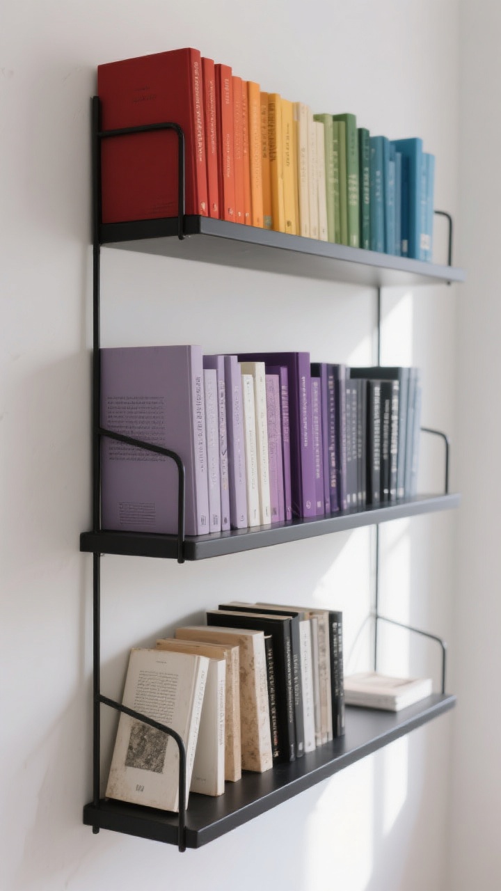
Color-coding is like the cat-eye eyeliner of shelf styling—bold, dramatic, and super satisfying when it works. But it doesn’t have to be a literal rainbow.
How to pull it off:
- Group by tones: Try warm (reds, oranges, yellows), cool (blues, greens, purples), and neutrals (whites, blacks, tans).
- Blend gradients: Go dark-to-light or vice versa on each shelf for that smooth ombré effect.
- Hide visual noise: Flip dusty or mismatched paperbacks spine-in on the bottom shelf (FYI: controversial, but it looks clean).
It’s aesthetic without being try-hard, and your eye will glide across the shelves like it’s on a runway.
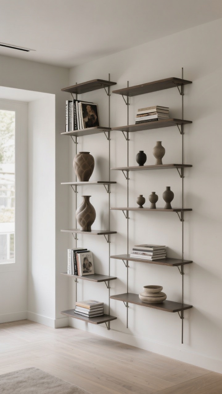
2. Mix Books With Objects Like a Gallery
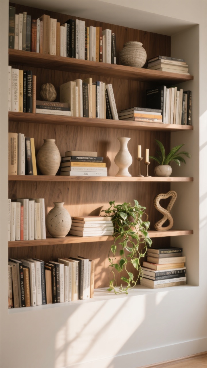
All books and no objects can feel heavy. Think of your shelf as a mini gallery wall—balanced, layered, curated.
The 60/30/10 rule:
- 60% books: Your main event.
- 30% décor: Vases, candle holders, ceramics, small sculptures.
- 10% plants: A tiny trailing pothos or a sculptural snake plant? Chef’s kiss.
Place décor in front of stacked books, not just beside them. The overlap creates depth and looks intentional, not cluttered.
3. Play With Vertical And Horizontal Stacks
Uniform rows are fine, but stacks add movement. You want your shelf to feel like a rhythm, not a spreadsheet.
Try these combos:
- Vertical rows for the classics and reference books.
- Horizontal stacks for paperbacks and art books—top with a candle, shell, or small tray.
- Anchor the ends with chunky bookends or a decorative bowl to avoid “leaning tower” vibes.
Alternating directions visually breaks things up without looking messy. IMO, it’s the easiest cheat for instant styling.
4. Curate A Monochrome Moment

Pick a single color and commit—white spines, black spines, or earthy tans. It’s calm, cohesive, and perfect if your room is already busy.
Make it dynamic, not flat:
- Vary heights and spine textures (linen, glossy, matte) for interest.
- Add metallic accents like brass bookends or a gold picture frame.
- Use negative space: Leave a few intentional gaps so your eyes can breathe.
Monochrome shelves read elevated, even if half the books came from your cousin’s yard sale. We love a stealthy glow-up.
5. Style With Art: Layer, Lean, Repeat
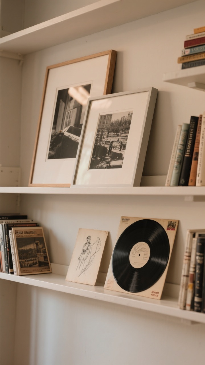
Art on shelves? Yes, please. It brings personality and breaks up all those rectangles with, well, more stylish rectangles.
How to nail it:
- Lean framed art behind books for depth. Start with one larger piece per shelf, then layer a smaller print in front.
- Mix media: Photography, sketches, vintage postcards, even a record sleeve.
- Keep glass minimal if you get glare—matte frames look luxe and photograph well.
It’s casual, not museum-y. Like your shelf just happened to look perfect.
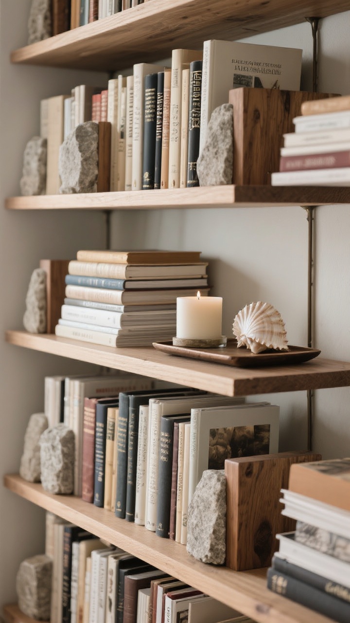
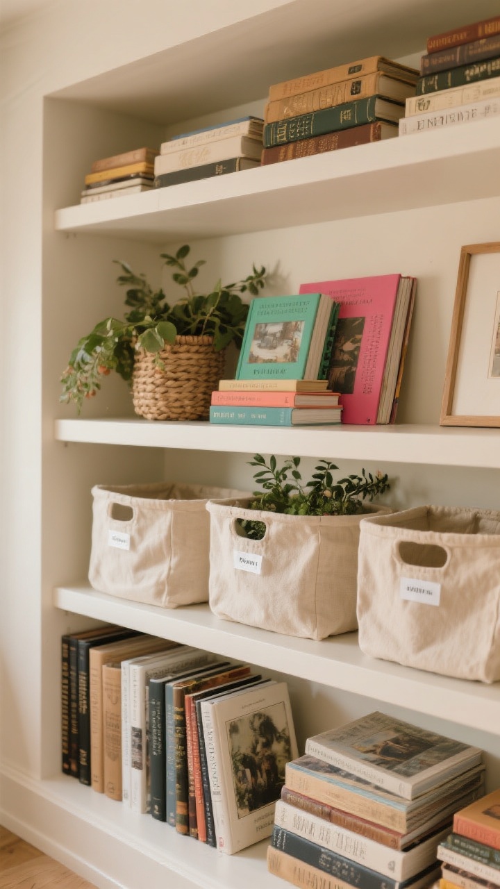
6. Add Texture: Baskets, Boxes, And Natural Materials
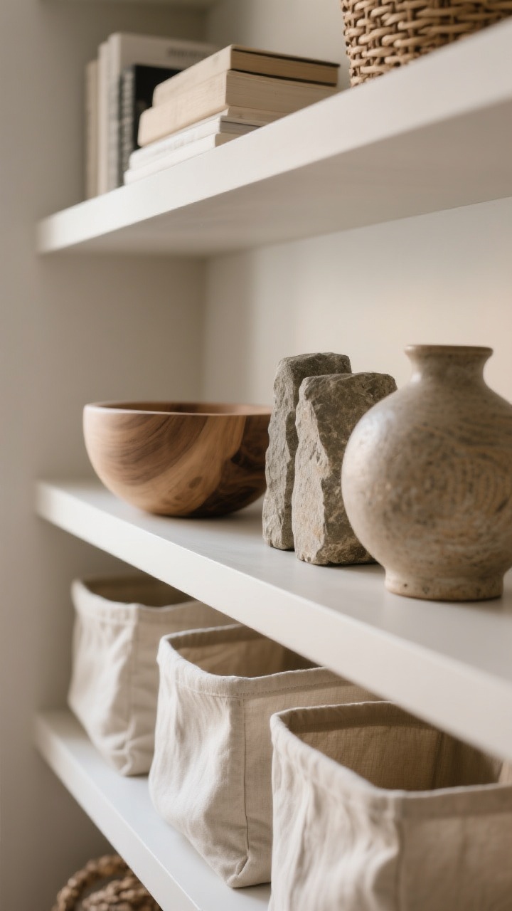
Texture is the secret sauce that makes shelves feel styled, not staged. Think organic shapes and tactile finishes.
Texture toolkit:
- Woven baskets for cords, controllers, or random chaos you’re not ready to confront.
- Linen or canvas bins for a softer, Scandinavian vibe.
- Natural accents like wood bowls, stone bookends, or ceramic vases to keep it grounded.
Mix smooth and rough finishes so it doesn’t go too rustic or too sleek. Balance is your bestie.
7. Embrace Negative Space (A.K.A. Don’t Fill Every Inch)
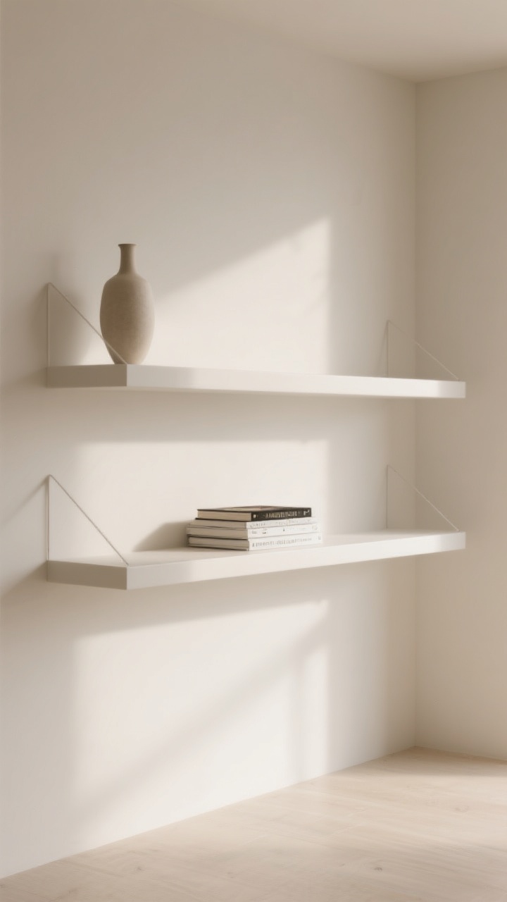
Hot take: empty space is a design element. When every shelf is stuffed, nothing stands out.
Where to leave breathing room:
- Top corners—add a single tall vase and call it a day.
- Center pockets—leave a gap around a standout book stack or sculptural piece.
- Edges—float items away from the ends to look deliberate, not crammed.
It feels calmer and more editorial. Like your shelf had a spa day.
8. Create A Mini Theme: Travel, Vintage, Or Cozy Reads
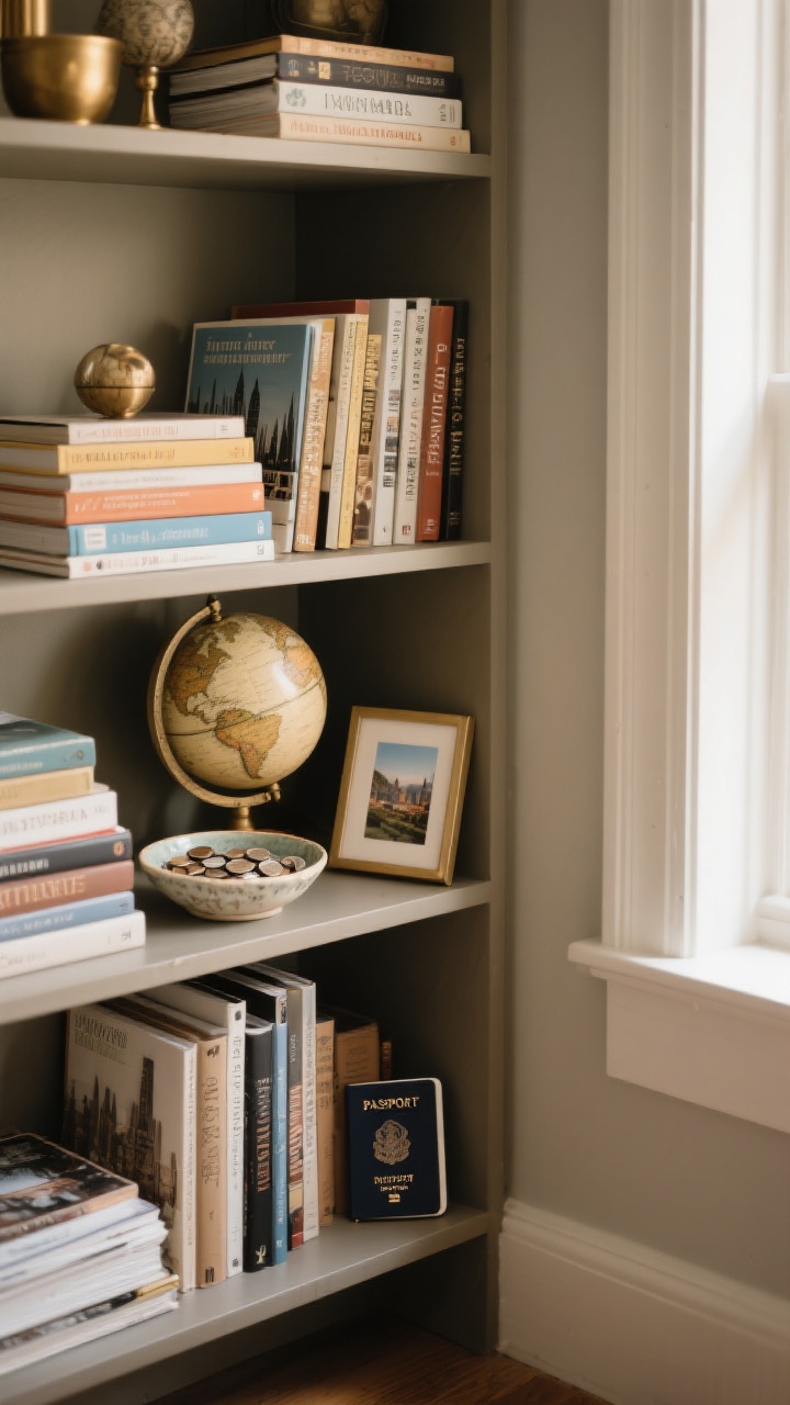
Pick a vibe for one section and lean in. It tells a story and keeps things from feeling random.
Ideas that never fail:
- Travel nook: City guides, souvenirs, a tiny globe, and a framed photo from your favorite trip.
- Vintage corner: Old hardcovers, brass accents, a retro clock, and botanical prints.
- Cozy reading zone: Poetry, a ceramic mug, a candle, and a chunky knit draped over the side. Cozy is a personality trait.
Curated themes = instant personality without buying out an entire store.
9. Light It Right: Mood Lighting Makes The Look
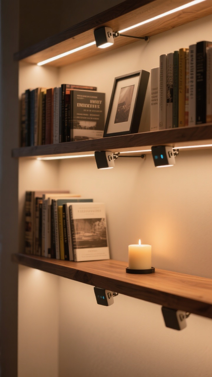
Good lighting can make a basic shelf read like a boutique. Bad lighting makes it look like storage. Choose wisely.
Lighting options:
- Clip-on picture lights for a gallery vibe—look for rechargeable options if wiring is a pain.
- LED strip lights on the underside of each shelf for soft, modern glow.
- Mini lamps or candles on a lower shelf for warmth (use flameless if your shelves are tight—safety first).
Warm white bulbs make everything look expensive. Cool white turns your novels into hospital décor. Don’t do that to them.
10. Go Asymmetrical With Shelf Layouts
If you have adjustable shelves, play with heights. Symmetry is safe; asymmetry is chic and makes your collection feel curated over time.
Design moves to try:
- Stagger shelf heights so tall art books and vases have one dedicated “airier” shelf.
- Offset groupings: Heavy on the left of one shelf, heavy on the right of the next—visual zigzag.
- Use a focal odd number (3 or 5 objects) per shelf. Your eyeballs love odd numbers. It’s science-ish.
Asymmetry adds movement. Your shelves will feel alive, not catalog-stiff.
11. Style For Real Life: Function First, Then Fancy
Pretty is great, but you still need to actually find your books. The trick is blending function with aesthetic—form and function can share the stage.
Smart strategies:
- Zone by use: Everyday reads at eye level, heavy art books lower, sentimental or rare pieces higher.
- Label subtly: Slip stylish tags on baskets or use a tiny label maker with clear tape. Organization, but make it cute.
- Rotate seasonally: Swap in fresh covers, greenery, or a new color accent every few months. Keeps things from feeling stale, ASAP.
When your shelves work for you, maintaining the look is a breeze—not a weekend project you dread.
Quick Styling Checklist (Pin This In Your Brain)
- Mix vertical and horizontal stacks.
- Blend books + objects + plants.
- Lean art for depth.
- Use texture and negative space.
- Layer in lighting and a theme.
- Keep it functional so you actually read the books.
Ready to give your shelves a makeover? Start small—shuffle a few stacks, add a plant, lean a print—and watch the whole vibe upgrade. Your books deserve a stage, and your space deserves to look intentional. Go make your shelves the main character.